I've decided to use my CD case idea instead of the DVD case. I made this decision as I thought that the imagery used on the CD case would match up to the website design much better than the reds and silvers used on the DVD case. The CD case also gives me much more creative freedom as I can design an interesting and individual digipak which would be highly resource consuming with a DVD case.
Following is my final design:

The image above would become the outlay of the digipak, it will fold in half in the middle then back on itself for either end of the skateboard to become the front and back of the case; the folding lines defined by the four different shades of grey.

The image above would become the inlay of the digipak, providing the consumer with the lyrics of the single 'SOS' and where to find the band online.
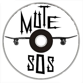
Above is the CD graphic I decided to design as part of the digipack. The serif font I used on the CD graphic has pointed and arrow headed ends to the lettering which is reflective of the hardness and dangerousness of rock music. The reason that it is different to the current front cover of the digipak is that the font on the CD is not available at college but available at home; this will be resolved asap.


