In what ways does your media product use, develop or challenge forms and conventions of real media products?
My music video uses straight cuts and short shot lengths in time to the rhythm of the song to create a pleasant flow to the video. In my research of other rock music videos I found that in the majority of them the performance aspect to the videos are in either the very slow tempo sections or the very fast tempo sections. I used both, however, I did use some straight cutting and short shot lengths in a slow instrumental section to the song. Although the tempo of the cutting did not perfectly match the tempo of the music I thought that this would be effective by presenting numerous different angles of the band performing to the audience.
The narrative of my music video is about a fan of the band making his way to the gig (the performance sections to the video) but by the end of the video the fan is hit by an oncoming car. This is one of Dyer’s star values, the ‘youthful’ arrogance of thinking you are invincible and therefore more likely to take unnecessary risks, such as skateboarding on a busy road. The casted band members also have a ‘youthful’ teenage appearance, in particular the female bassist. Although she is not the front man of the band, being a woman grants her and the record label the ability to sell the band, through her body, to a male audience. This could be part of Keith Negus’s theory of a Synthetic Ideology where the band’s record label would manipulate and construct an image for the band members.
The band is always seen together in a medium to long shot which simulates the relative distance you would be from the band at a real stage performance. I also decided to use frequent close ups of instruments and the band members’ faces. I made this decision to be consistent with Pete Fraser’s
theory of camerawork codes and conventions in music videos.
The ending shot in my music video is of the skateboarding fan skateboarding on the road when a large off-road vehicle is seen driving towards him in a point of view shot. When the vehicle gets close enough to hit the skateboarder the video cuts straight to black as if he is hit by the vehicle. Although the audience do not find out what happens to the fan, one can only assume he is hospitalised. This fits in with Pete Fraser’s Codes and Conventions of Narrative and Performance in a Music Video as he states that “Narrative in songs is rarely complete” suggesting that the narrative is completely laid out by the director and simply left unfinished so the audience may conclude the video in whichever way they see fit.
 The mise-en-scene of my music video for the performance sections is predominantly outdoors in front of vivid greenery. Taking into consideration Pete Fraser’s Theory of Narrative and Performance, this may be portrayed as the band wanting their audience watching the video to embrace the environment and look after it, suggesting a very positive message. Rock and Alternative bands in general almost always will promote a very positive message in their songs and music videos. This is a good example of Keith Negus’s Organic Ideology of Creativity as most bands of this genre only care about the messages they portray in their music and how much of a positive impact they can make on the planet.
  How effective is the combination of your media product and ancillary texts?
My ancillary texts, website and Digipak, are fairly linked. Reflecting back on my work I would have liked to of put in some more imagery of the band members in my Digipak to create an intimacy between the band member’s and the fan’s which is described in Pete Fraser’s theory of camerawork codes and conventions. However, I did create a link between the video and Digipak by using a skateboarder in the video and then a skateboard as the primary imagery used in the Digipak.

 I believe that this would help remind the fans of the band about the video when they looked back over old albums or vice versa when watching the music video. This would help advertise the album and new video.
My use of imagery on the website presents the band in a pleasant and 'down to earth' way. This is because of the naturalistic setting that I took the pictures and the comedic positions that the band are in. I made these decisions as I believe that one of the key factors in rock music is that the fans know the band on a very personal level. This can be done through my use of imagery or through an autobiography. However, an autobiography would take much more time and money for both the consumer and the band member, therefore using specific imagery would be more practical.
What have you learned from your audience feedback?
I received my feedback through a class screening of each Music Video, Digipak and Website. Each class member would move around the room to different computers and leave feedback about the Website and Digipak, opened on said computer, in a word document. The same was done after screening each Music Video respectively.
My Digipak was praised for the simplicity and clear link to my music video with the use of a skateboard as the main imagery. When I made the decision to create this link I intended it to help both the Digipak and the Music Video advertise each other. For example when a fan would watch the video and see the skateboarding fan, they would remember the Digipak then think “oh that album was really good wasn’t it?” and possibly go and listen to the album again creating a cycle of recurrence.
The class also picked up on the use of a font designed for the band used on my Digipak. When designing my Digipak I made a few mental notes on what I would like the font to look like and to possibly symbolise. I came up with a few ideas but in the final draft I decided to use a very messy and erratic font. This font was very similar to a crazed scribble and so reflected the band’s Rock and Electronic influences. Throughout the Digipak I used this font when using the band’s name ‘Mute’ and when naming the band members on the inside informational page. I chose to do this as I have noticed this technique being used in some real Digipak’s and Album cases.
Another symbolism I was trying to convey that the class review picked up on was my combination of an individual font and the skateboard. Many skateboarder’s will listen to Rock music, although of course anyone will listen to music of their own taste in music, but in most cases a skateboarder will generally listen to Rock and Alternative music for the fast paced guitar solos and often fast songs to skateboard to, as skateboarding is a very fast paced pass time.
An improvement that I was unaware of was noted during the review, all the information on the inside was on one page. As the Digipak consisted of 4 panels I had plenty of space on the two middle panels to spread out the information and make the page with all the information on seem less condensed together. If I had made this improvement I believe that the Digipak would have appeared far more comfortably laid out.
 Another piece of constructive feedback mentioned was the fact that there were no spines included on the Digipak. One class member said that “This would make the Digipak very flat and difficult to store.” I think that it would consume much less space and make storing more practical. Although, on the other hand if the consumer has stored their CD’s on a CD rack then the Digipak would fall short of filling the allocated space. However, I do not believe that this would make a difference to whether or not this Digipak would be purchased and so I would like to keep the Digipak design as a flat Digipak to save costs on production and the planet by using less material.
I received noticeably more comments on my website design in comparison to my Digipak. One of which was the animation of ‘Mute’ in the top left corner of each page, it was praised for the simplicity and how a similar simplicity linked my website and Digipak together. My website was made with the intention to design it around a single page navigation system where the visitor would click on different sections to the website at the top of the page. This combined with the animation was praised for the use of easily flowing between each section of the website.
 When designing my website in Adobe Dreamweaver CS4, I experimented with a tool that allowed rollover images. I used this tool to distort the navigational links at the top of the website when the cursor was moved over the link. This aspect was praised as it was ‘aesthetically pleasing’ and ‘quite nifty’ as some class members said. I chose to use this tool to link with Mute’s font on the Digipak being distorted.
When deciding to manipulate my images of the band member’s together I used my experience as a photography student to exercise my most favourable abilities using Corel Paint Shop Pro Photo X2. On the image for the homepage I used a technique called colour splash in which some items in an image would be selected to stay in colour and the rest of the image would be changed into greyscale. This technique was simple to execute and very visually pleasing to those without knowledge of how it is achieved.
 The content of my website was also very well received as it was ‘very detailed’ and ‘clearly framed’. This reception was achieved by my ‘one page’ design, no scrolling and simple navigation that was not too messy provided maximum clarity and above all visually accessible sections to the website. In a real website designing situation, if the website were to expand any further there would also be symmetrical space to fit in a site map.
Equally, there were as many constructive feedback points as there were positive feedback points. One of which was how the ‘Pics’ page was not framed as squarely as the other pages. This was because instead of using an even number of images I used three; this created a gap on the right hand side of the window and therefore made this section of the website spear incomplete. This was not a personal choice it was simply because of time restrictions and attempting to meet other subject deadlines along with my Media coursework deadline.
 As I was nearing the deadline to hand in the website I had forgotten to include an MP3 of the song in the final draft, this was a mistake as the draft did include an MP3 on the homepage but due to my own idiocy in the final draft I managed to miss out including the track and therefore losing some marks.
The fact that almost the entire website was black and white was picked up on; this was my intention from the beginning. Not only would it link together my Music Video and my Digipak but it would create a simplistic and dramatic effect. Overall my main reason to keep the website in black and white was that most of Mute’s songs are not about flowers and happiness but about loss of love and such things that rock bands often sing about. Therefore, a very colourful website would not effectively represent what Mute are about.
How did you use new media technologies in the construction and research, planning and evaluation stages?
At the beginning of the course we were requested to find a music track that we would like to make our music videos for. The class was advised to start looking on www.unsigned.com to easily search and sample many different bands or artists as quickly as possible. I began by using the Genre search as I knew I would like to do a rock or metal music video and found many less fortunate in the skill of making music. This task was becoming long and arduous and so, after deciding that there were none to be found, I returned to www.unsigned.com's homepage and on the featured artist section I discovered a band called Mute under a Rock/Electronic genre. After listening to several of their songs I decided upon using the song 'SOS'. I believe that without Unsigned’s ‘Featured Artist’ section of the homepage my journey to find an adequate song would have taken far longer than it did.
For the video analysis I used www.youtube.com and www.mysapce.com to find my desired videos to emulate what I would be attempting to create in the future months. I chose to use these two websites as they are both profoundly used amongst the music industry to advertise band's and keep their fans up to date with live performances and upcoming album releases.
During the planning stages I created a brainstorm of ideas for my music video. To do this I used the program Inspiration which allowed me to conveniently manipulate and create numerous texts to simulate a brainstorm. I chose to use this program as hand writing a brainstorm would have taken much more time and would require me to either scan or take a photo of to upload onto my blog.
For my location reconnaissance I used a Nikon D40 DSLR. I chose to use this camera mainly because I knew it would produce high quality images for me and partly because it was ready and at hand for me to use. As a result of this, my reconnaissance images were of high quality allowing clarity for all to see.
 For the creation of my Mock Website I decided to use Corel Paint Shop Pro Photo X2. This is because my lack of artistic skill and large amount of experience using CPSPPX2 would allow me to create something that would be very visually similar to the final creation, with some minor adaptations. By using CPSPPX2 it would also allow me to efficiently adapt my idea by moving text and images to different locations quickly without need to erase and re-draw the idea.
 Similarly, I use CPSPPX2 to create my Mock DVD Digipak and Mock Digipak for the same reasons. I chose to make both a DVD and Digipak as this would give me more options in the future after filming to decide upon which would make the more practical pathway for me to choose.
When uploading my Draft Edit of my music video, instead of uploading straight to www.blogger.com I decided to use my current www.youtube.com account. This is because I prefer to have something to reflect upon in the future and that there are several more viewing options in comparison to blogger's video player. By using YouTube I have granted a much broader audience access to my video, therefore allowing feedback from the YouTube community in the near future. I also thought that when doing the same to upload my Final edit, this would make it much easier to compare the two videos and again receive more feedback form a wider ranged audience.
 As I did with the location reconnaissance, I used the same Nikon D40 DSLR to take the photos of my skateboard for the contents of the Digipak. I chose to use the D40 for the same reasons as when I used for my reconnaissance images. As the images were the same high quality as previously mentioned it allowed me to effortlessly manipulate the images to my desired look in CPSPPX2.
During filming I used a Velbon DV-7000 tri-pod as I would be filming in heavy wind and this Velbon tri-pod is a very durable 3.37KG and so would not move at all in heavy wind. I also used this tri-pod for the extended height of 162.5cm for a good eye level shots and 58.8cm minimum height for excellent low angle shots. Both of these became vital as level close up shots of the singer lip syncing and close up shots of the instruments being played, combined with low angle shots of each of the band member's, play vital parts in creating a rock video.
 The camera I used was a Sony MiniDV Camcorder as it was the only camera available to me at the time. I would have preferred to of used a HDD Camcorder as it would have saved many hours of capturing in real time. This is because it has a Hard Disk and not a miniature VHS, a Hard Disk would allow instant digitally recorded footage, therefore reducing capturing time significantly. A HDD Camcorder would also provide better quality footage and ultimately a more aesthetically pleasing piece of work which would make my video appear more professional as requested by the coursework criteria.


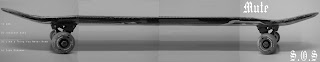 The image above would become the outlay of the digipak, it will fold in half in the middle then back on itself for either end of the skateboard to become the front and back of the case; the folding lines defined by the four different shades of grey.
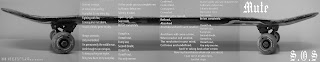 The image above would become the inlay of the digipak, providing the consumer with the lyrics of the single 'SOS' and where to find the band online.
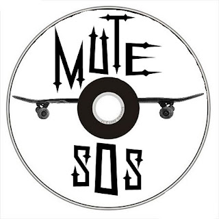 Above is the CD graphic I decided to design as part of the digipack. The serif font I used on the CD graphic has pointed and arrow headed ends to the lettering which is reflective of the hardness and dangerousness of rock music. The reason that it is different to the current front cover of the digipak is that the font on the CD is not available at college but available at home; this will be resolved asap.


